E-Commerce · UX & UI Designer · 5-Day Google Sprint Mock Project
House2Home Case Study
Scroll ↓

Problem
New apartment dwellers want to purchase multiple decorative items to make the place more welcoming. Budget constraints and the overall appearance of self-picked items usually challenge them. They also like to avoid being overwhelmed by thousands of inspirational photos or décor items that could be chosen.
Goal
The goal of House2Home Sprint is to help new apartment dwellers quickly find décor accessories that would give their spaces a “face-lift.”
Solution
I adopted Google Ventures (GV) Design Sprint, a hybrid model of quickly visualizing solutions to a critical user's need through design, prototyping, and testing.
I kept the process simple and intuitive - users can shop at “Product Selection (PS),” which adopts a classic category & search model, or they can utilize the new feature “Design Space (DS),” a virtual reality that interacts with the items they picked. “Design Space (DS)” significantly reduces the uncertainty and imaginative workload, ultimately making users confident and satisfied with the purchase. In addition, a recommendation section featuring “Designer’s Pick” & “Top Sellers” also helps users decide or get inspiration without leaving the website.
My Role
UX and UI Designer through the 5-Day Sprint.
Day 1
UX Research & Journey Mapping
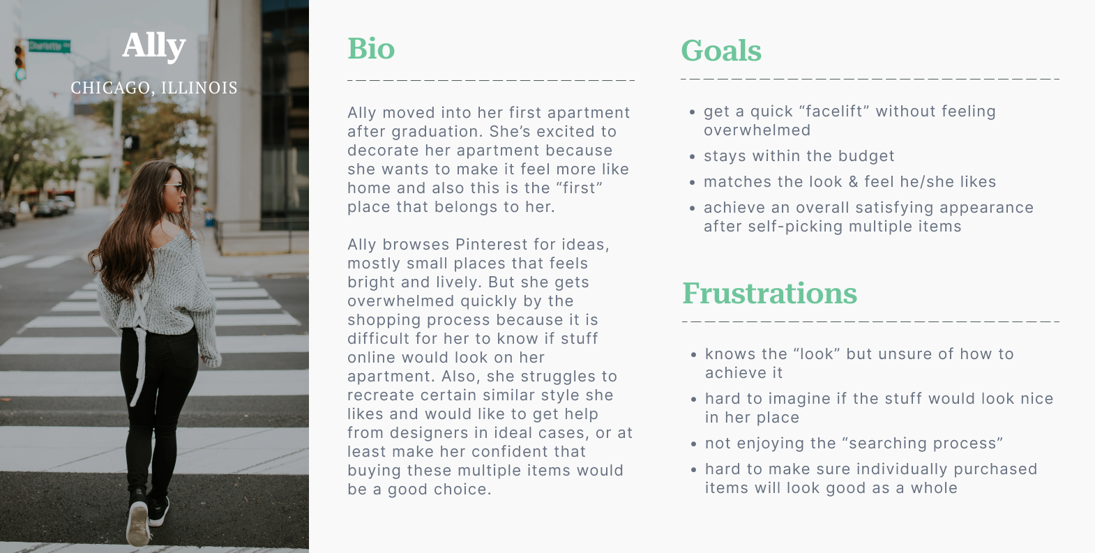
Started by synthesizing and understanding the motivation, goal, and frustration of apartment dwellers’ home décor shopping experience.
Journey Mapping
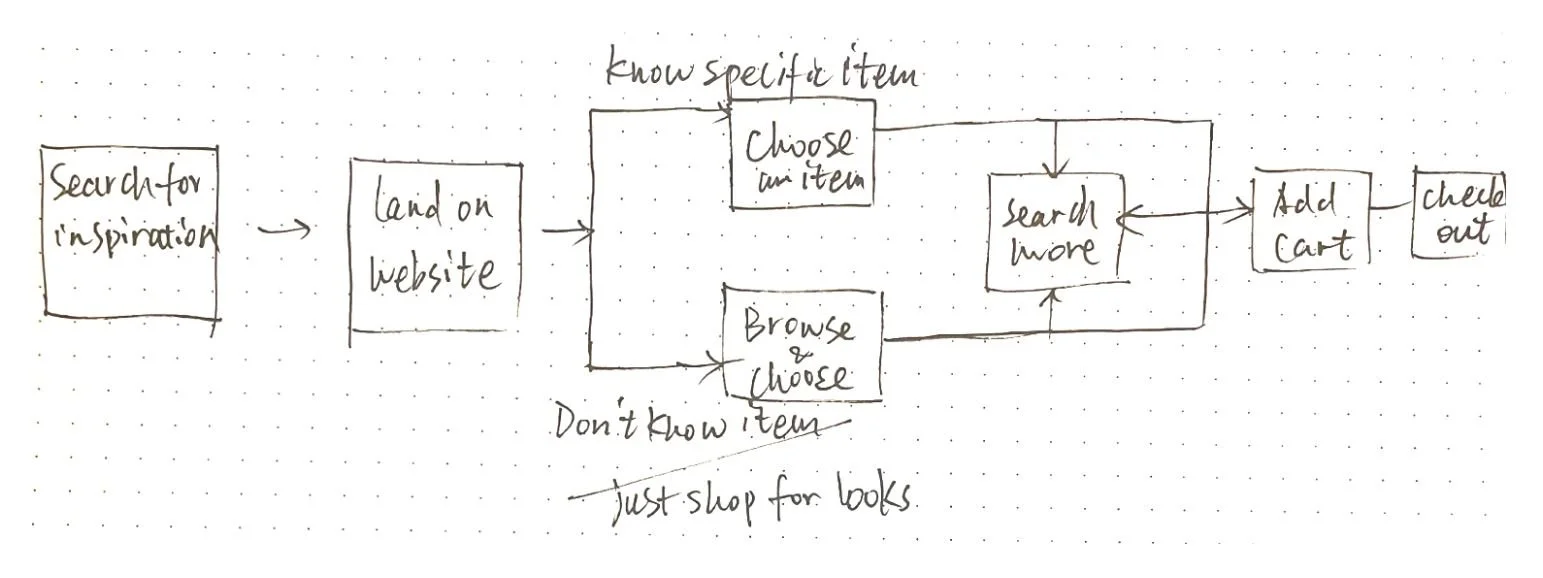
After reading into user statements, interviews, and research insights, I concluded users (shoppers) generally follow a similar process below when searching for home décor items.
Who are my users?
New apartment dwellers who are actively self-picking multiple items to decorate the new place. They want a good touch-up to the final appearance without spending too much effort searching.
Day 2
Sketching
After understanding the users and the shopping process, the primary task becomes clear - when users try to “choose an item” & “add to cart.” Brainstorming focuses on making these two easy while answering shopper goals.
Lightning Demos
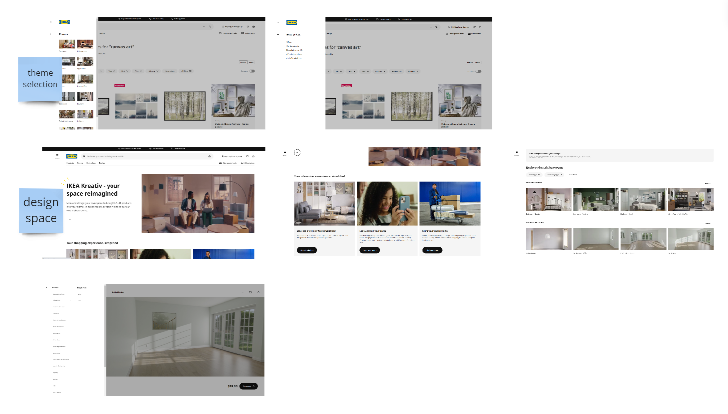
I ran a lightning demo session to find inspiration from designs that answer similar questions. The companies that I studied include IKEA, Farfetch, Wayfair, and Pinterest.
Crazy 8s Exercise
I devised many possible features and focused on a “visual space” to showcase the items since it is practical and answers users’ pain points.
Solution Summary
I designed the shopping experience to be straightforward—users can choose between “Design Space” and “Product Selection.” The former visualizes the overall appearance instantly, and the latter provides a traditional yet clean way to ensure a comfortable feeling.
In addition, users can get inspired from the recommendation section (“Designer’s Pick” & “Top Sellers”) to reduce shopping efforts while feeling confident about their purchases.
Sketching of the solution
Key Features & Insights
-
Shoppers can visualize how an item sits in the room effortlessly, with the option to move around, add to cart, or delete from the space.
-
No matter which shopping path is chosen, filtering out the needed item is always simple.
Under “Product Selection,” simply apply filters to sort items based on price, recommendation, color, etc.
Under “Design Space,” seek the desired item fast under the option “category” & “search,” or stay in the section “add” to view all the items recommended based on the scan of their space.
-
Shoppers can add items directly from the product detail page to “Design Space” to ensure the final appearance is desirable; they can jump to the product detail page as well when they are satisfied with the item and want to check if other details (e.g., price, dimension, etc.) match their expectations.
-
Users complained about needing to be more confident during selection. The recommendation of “Designer’s Pick” & “Top Sellers” let them borrow proven ideas and instantly view the items achieving the final appearance from interactive nods.
Day 3
This is the time to unfold the core story of the shopper experience, creating the fewest screens possible, to establish the visual process of landing on the home page, selecting an item, to checkout.
Storyboarding
Wireframing
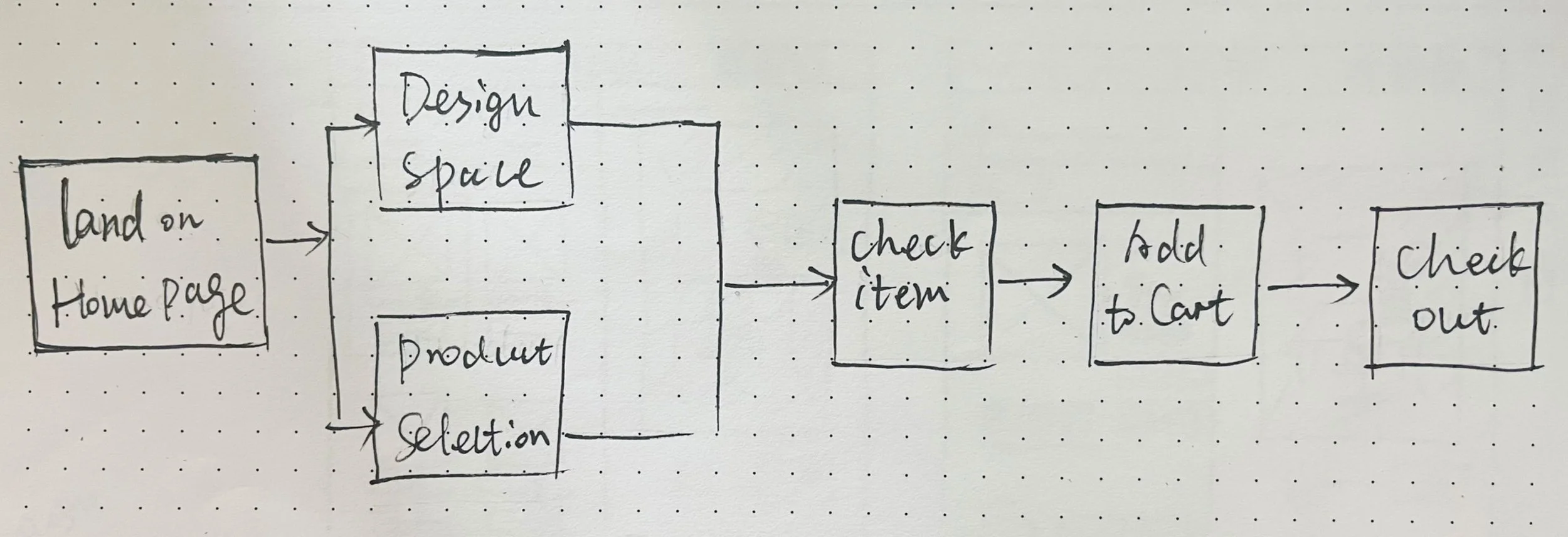
I followed the shopper’s primary flow to wireframe: landing on home page -> go to either “Design Space” or “Product Selection” -> check an item -> add to cart -> checkout.
Feature #1 - Design Space
The red route is below when a shopper chooses this path from home page.
Feature #2 - Product Selection
The red route is below when a shopper chooses this path from home page.
Feature #3 - Recommendation
Due to the time constraint, I skipped animation for interactive nods on the recommended images. However, I included observations and questions during testing since the current design is sufficient to get user feedback on whether this feature is helpful.
UI Design
Users prefer to avoid being overwhelmed by the selection process, especially since selecting, comparing, and imagining are already demanding during online shopping.
Therefore, I adopted the following guidelines:
Minimalist
Clean color palette (green, white, black, all other colors are shades of them)
Rich spacing
Aesthetically pleasing photos
Day 4
Worked with the style guide to create high-fidelity wireframes.
Prototyping
High-Fidelity Screens
During the animation, I made it as clean as possible. No flashy interactions, only the necessary ones to ensure no extra cognitive load needed to shop.
Design Space
Product Selection
Recommendation
Day 5
Testing
Started by synthesizing and understanding the motivation, goal, and frustration of apartment dwellers’ home décor shopping experience.
Process & Methodology
Conducted 5 moderated user tests with participants recruited through friends and colleagues who had experience shopping for decorative items.
Testing Goals
-
Do the new features help solve shoppers’ concerns about overall appearance, lack of inspiration, and overwhelming process?
-
Is the flow intuitive and straightforward?
-
Is the design attractive and trustworthy?
Overall Result
Testers gave pretty positive feedback on the new features regarding the usefulness and clean design. They all mentioned that the general shopping experience feels easy and intuitive, and most showed a strong interest and preference for Design Space.
Shruti
“Love the idea (Design Space)! I can see myself using it. I also really like the hover-over design, smart way to interact.”
Meg
“I was wishing something like this (Design Space) would exist. I would definitely used it!”
Bri
“I think the (Designer’s Pick & Top Sellers) is an excellent feature helping me to decide. I have many items I’d want so I need advice on making choices.”
Iteration
Iterations!
Started by synthesizing and understanding the motivation, goal, and frustration of apartment dwellers’ home décor shopping experience.
Recommended Iterations
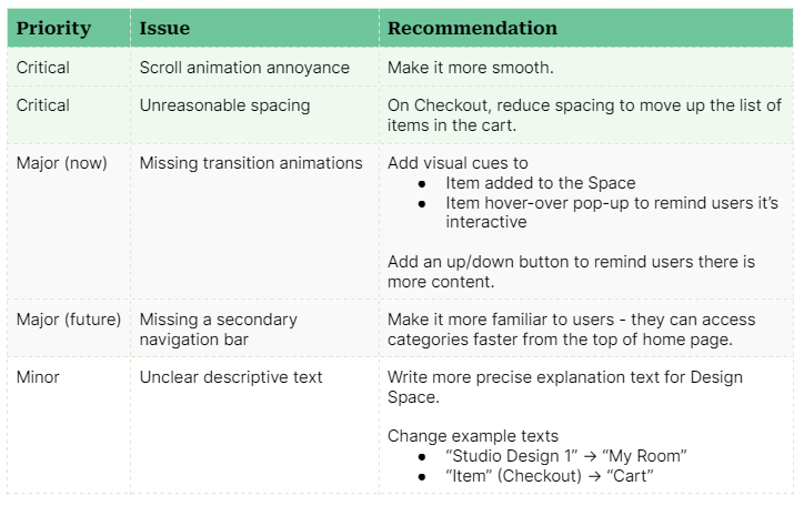
I categorized issues being identified from usability testing based on three priority levels: critical, major, and minor. Critical and major issues needed to be corrected right away while minor issues could wait if time didn’t permit.
Example (Critical Issue)
All iterations are completed according to the table. I picked one example “critical - unreasonable spacing & minor - unclear descriptive text” to help visualize the changes.
Most users mentioned that on the check-out screen, they were unaware that they could actually scroll down to view more content. Besides, the original title of “item” was misleading. Therefore, I moved the section up to signify more content and used a more accurate title.
Next Step
Here are the next steps for the project:
Set a second round of testing since the prototype is being iterated.
Depending on the feedback I will get, iterate the prototype again.
Retrospective & Highlights
The sprint model effectively uncovers rapid solutions to UX problems and creates an interactive prototype to test and iterate. I successfully designed a critical solution that has proven useful and favored by the target user group. At the same time, marching quickly through the “brainstorm - prototype - test - iterate” journey helped me exercise the following designer skills: time management, agile working, and adaptability to changes and adjustments.
To view the final interactive prototype after iteration, click here.
